Data Visualization
Data Analysis
– February 14, 2018
How to use Jupyter Notebooks and pandas to analyse data

webkid
@webk1d

Last year we discovered an extensive dataset on the subject of traffic on German roads provided by the BASt. It holds detailed numbers of cars, trucks and other vehicle groups passing more than 1,500 automatic counting stations. The amazing thing about this dataset is that the records for each counting station are provided on an hourly basis and they reach back to the year 2003. A dataset with aggregated yearly data per station is also available.
As this seemed like a pretty exciting dataset to explore, we started to come up with ideas for a visualisation. The project also got accepted by the mFUND program.
As an attempt to get to know the structure and to find a good way for dealing with the massive size of the dataset, we set up some Jupyter (formerly IPython) Notebooks. Notebooks are a great tool for doing data-analysis, so we used these to create simple charts and graphs that answer basic questions and give us insights into the data. In the following sections you can see how we produced helpful charts of a big amount of data with only a few lines of code.
Get started
First of all, you'll need to import some basic libraries. In our case, these are pandas, which provides data-structures, the tools to handle them and I/O utilities to read and write from and to different datasources, and matplotlib, which we will use to create the charts.
As we chose not to use a predefined color scheme, we also defined an array of colors for the graphs.
import pandas as pdimport matplotlib.pyplot as pltfrom matplotlib.ticker import FuncFormattercolors = ['#2678B2', '#AFC8E7', '#FD7F28', '#FDBB7D','#339E34', '#9ADE8D', '#D42A2F', '#FD9898','#9369BB', '#C5B1D4', '#8B564C', '#C39C95','#E179C1', '#F6B7D2', '#7F7F7F', '#C7C7C7']
In the following sections, we will produce three different types of charts: A linechart, a scatterplot and a stacked area chart. The linechart and the scatterplot will be based on the hourly data, while the stacked area chart will be used to display the data by year.
Linechart: Car traffic at one station
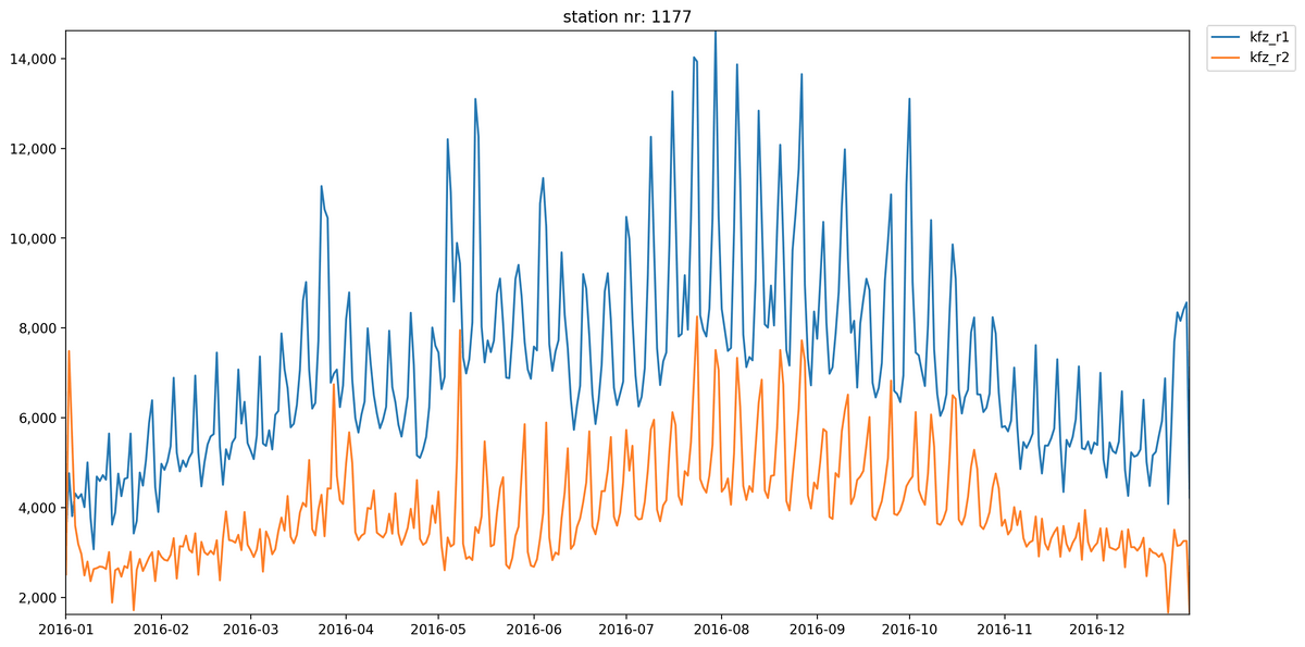
We will use a linechart to outline the frequentation of a single counting station during the year 2016. Therefore, we have to load the data from a csv into a
DataFrame object and use the group_by function to group it by station number. As it would be a lot of data to display on an hourly base, we will sum up the numbers for each day by first grouping them and then summing up the columns for both directions:# download file from http://www.bast.de/videos/2016_A_S.zipdf = pd.read_csv('2016_A_S.txt', sep=';')df = df[['Zst', 'Land', 'KFZ_R1', 'KFZ_R2', 'Datum', 'Stunde']]df.columns = ['nr', 'land', 'cars_r1', 'cars_r2', 'date', 'hour']# convert values in 'date' column to DateTimedf.loc[df.hour == 24, 'hour'] = 0df['date'] = pd.to_datetime( df['date'].astype(str) + '-' + df['hour'].astype(str), format='%y%m%d-%H')grouped_by_name = df.groupby(['name'])grouped_by_name = df.groupby(['nr'])number = 1177station = grouped_by_name.get_group(number)station_days = station.set_index('date').groupby([pd.TimeGrouper('D')])[['cars_r1', 'cars_r2']].sum().reset_index()
The code for generating a linechart is quite straight forward. We use subplots to set a size for the chart (
figsize=(15, 8)). In ax.plot(y, x, ...), one line is plotted to the chart. This is done twice, as traffic should be shown in both directions. The set_major_formatter function is used for formatting the values of a chart's axis. In this case, numbers are displayed with ',' as thousands separator. plt.show() will display the chart.fig, ax = plt.subplots(figsize=(15, 8), dpi=200)ax.plot(station_days['date'], station_days['cars_r1'], c=colors[0])ax.plot(station_days['date'], station_days['cars_r2'], c=colors[2])ax.yaxis.set_major_formatter(FuncFormatter(lambda x, p: format(int(x), ',')))ax.legend(loc='upper right', bbox_to_anchor=(1.1, 1.02))plt.title('station nr: ' + str(number))plt.margins(0)plt.show()

Having a look at this chart, it becomes clear that there is a lot more traffic in direction 1 than in direction 2 throughout the year at station 1177. The reason could be that this is the first counting station on the Autobahn A23. The ups and downs in the chart make it clear that there is a less traffic during the weekends.
Scatterplot: Top 3 busiest days per state
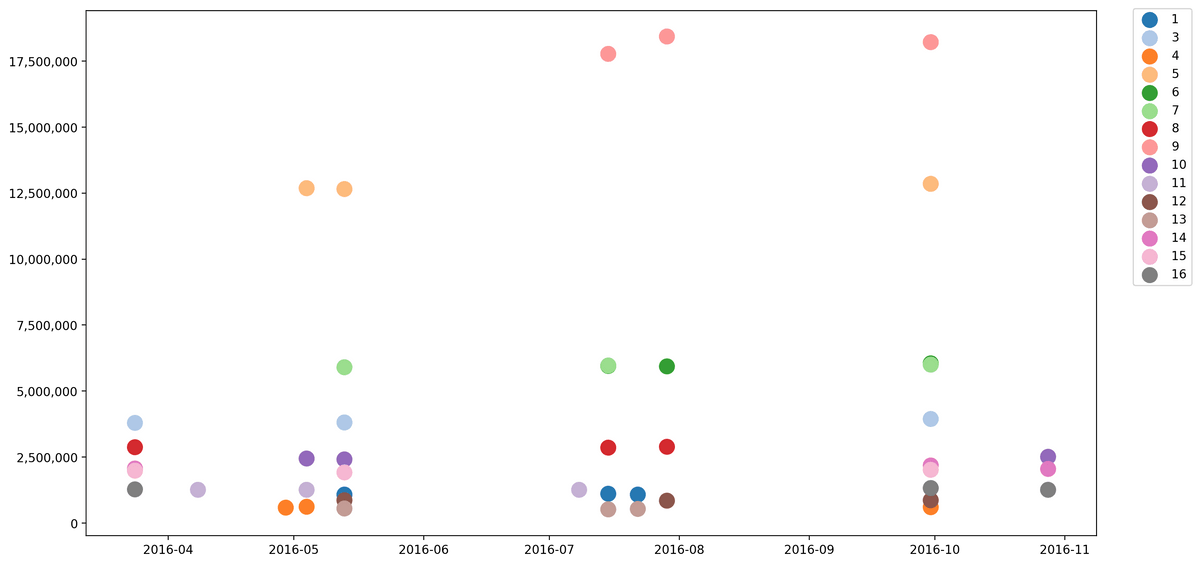
To show the top 3 busiest days per state, we decided to use a scatterplot. Before the graph can be generated, the dataset needs a bit of restructuring. First, we add a column
sum (sum of the traffic in both directions) to the DataFrame. Then the data is grouped by both land and day before sorting it by sum. As only the top three days per state should be displayed, head(3) is used to in order to get the first five elements.df_scatter = dfdf_scatter['sum'] = df_scatter['cars_r1'] + df_scatter['cars_r2']df_byday = df_scatter.set_index('date').groupby(['land', pd.TimeGrouper('D')])[['sum']].sum().reset_index()df_sorted = df_byday.sort_values(by=['sum'], ascending=False)df_clean = df_sorted.groupby(['land']).head(3)
When it comes to generating the chart, we need the data grouped by
land. For each land all elements can be added to the plot by using ax.scatter(x, y, ...). Make sure to set a label, otherwise it's not possible to create a legend:groups = df_clean.groupby('land')scatter_colors = iter(colors)fig, ax = plt.subplots(figsize=(15, 8), dpi=200)for name, group in groups:dates = group['date'].dt.strftime('%Y-%m-%d').valuesdates = [pd.to_datetime(d) for d in dates]ax.scatter(dates, group['sum'].values, s=150, c=next(scatter_colors), label=name)ax.yaxis.set_major_formatter(FuncFormatter(lambda x, p: format(int(x), ',')))ax.legend(loc='upper right', bbox_to_anchor=(1.1, 1.015))plt.show()

As you can see, the top 3 busiest days in the federal states focus on ~10 days of the year. These peak days can be explained by the start and end of vacations and holidays in the country. For example, lectures in most universities start on October 1st, which explains the high amount of traffic on September 30th.
Stacked area chart: Development of truck traffic on country roads
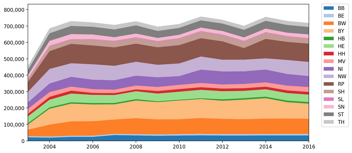
Last but not least, we took a look at the yearly data, which provides the aggregated numbers per year for each station. We created a stacked area chart to find out if there was a change in the traffic after that in 2005 the 'LKW-Maut' was introduced in Germany.
After loading
year_data.csv, all elements with value 'A' (Autobahnen) in column str_kl are excluded, as we only want to check if there was more traffic on country roads. The DataFrame is then grouped by land, so each land can be displayed as one layer in the chart.df_stacked = pd.read_csv('year_data.csv', sep=';')df_stacked = df_stacked[df_stacked['str_cl'] != 'A']grouped_by_land = df_stacked.groupby(['land'])
In our case, three arrays are used to generate the graph:
years: x-axisrows: areas to be stackednames: labels for areas
These arrays are filled with data by iterating over the
grouped_by_land object. Note that years and names are one-dimensional arrays, while rows is two-dimensional. Finally we plotted the data to the chart using ax.stackplot(x, y, ...).x = [2003, 2004, 2005, 2006, 2007, 2008, 2009, 2010, 2011, 2012, 2013, 2014, 2015, 2016]names = []rows = []for name, land in grouped_by_land:by_year = land.groupby(['year'])['trucks_r1', 'trucks_r2'].sum()names.append(name)data = (by_year['trucks_r1'] + by_year['trucks_r2'])data = data.fillna(method='pad').valuesrows.append(data)fig, ax = plt.subplots(figsize=(10, 5), dpi=200)ax.stackplot(x, rows, labels=names, colors=colors)ax.legend(loc='upper right', bbox_to_anchor=(1.15, 1.02))ax.yaxis.set_major_formatter(FuncFormatter(lambda x, p: format(int(x), ',')))plt.margins(0, 0.1)plt.show()

The chart shows that the traffic on country roads developed differently than expected and there is no significant rise in the year 2005, when the LKW Maut was introduced.
The notebook on GitHub
Wanna have a closer look? Ideas and suggestions for further visualizations are very welcome!
Feel free to check out the notebook on GitHub in case you want to play around with the code.
Further Reading