This morning, Britain voted to leave the European Union. Here are some maps and charts that show the referendum results and what consequences might follow.
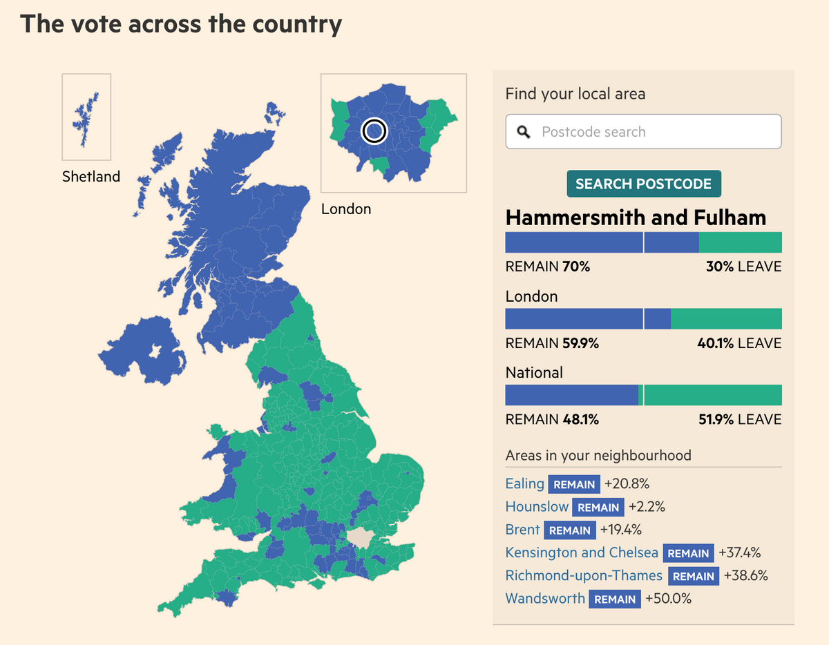
Financial Times: EU referendum results
Detailed breakdown of the referendum results in an interactive map as well as charts for every regional poll.
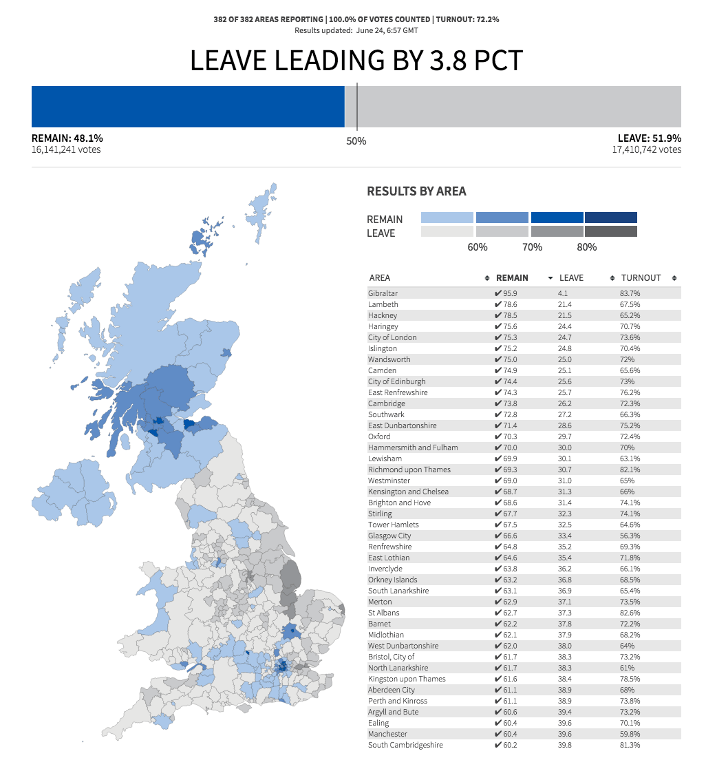
Reuters: Britain votes to leave EU
Interactive map of the referendum results.
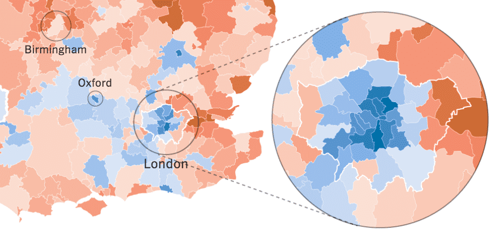
The New York Times: How Britain voted in the E.U. Referendum
A static map of referendum results with focus on London.

Wall Street Journal: 'Brexit' Referendum
Live results from the referendum with focus on stock development.

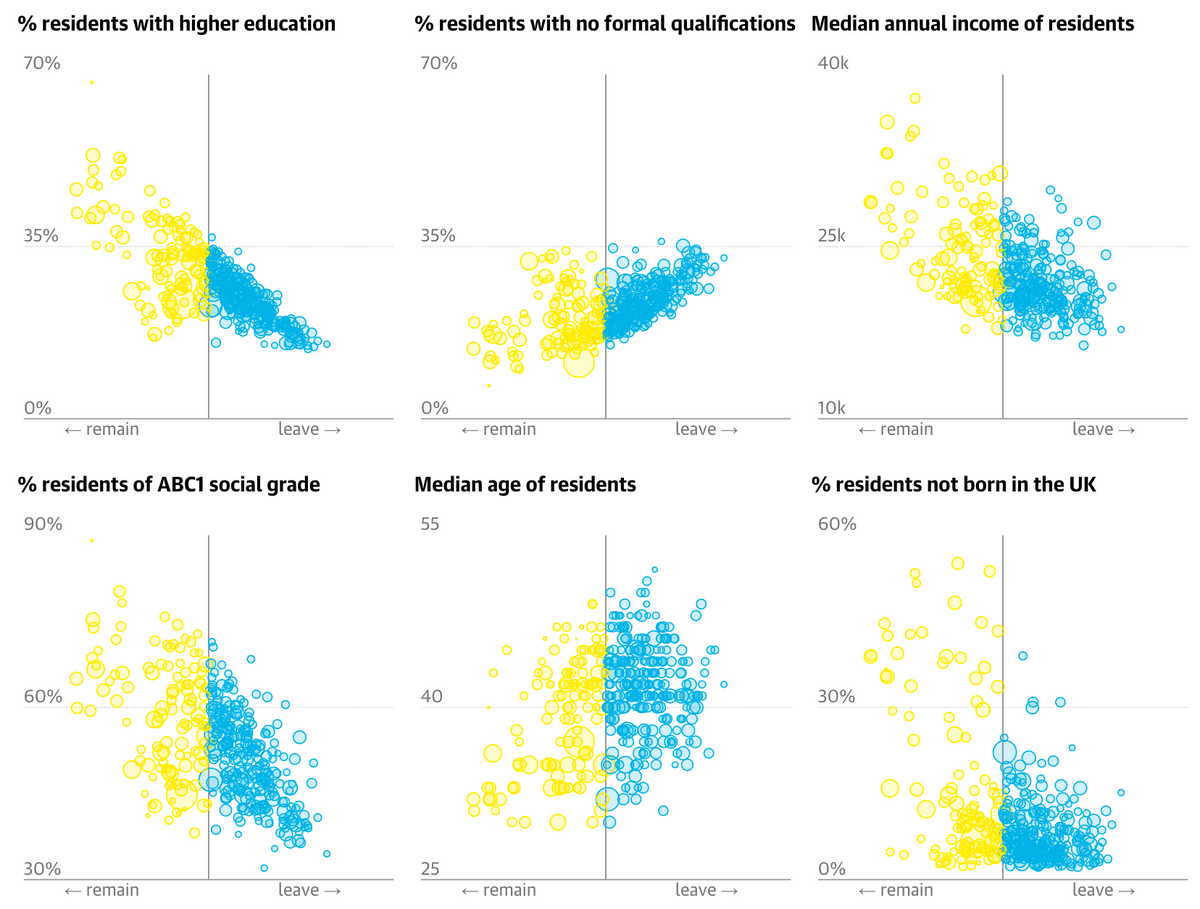
The Guardian: EU referendum results in full - find out how your area voted
Live map of the results as well as scatter plots with demographic data.
NZZ: Alle Resultate aus Grossbritannien auf einen Blick
Map of results plus some charts with more detailed findings.

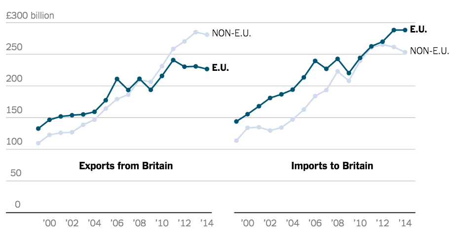
The New York Times: What Is Driving the ‘Brexit’ Debate, and What a ‘Leave’ Vote Could Mean
Some charts that explain what could happen if Britain leaves the EU.
Financial Times: A people divided
Scatter plot of voting results vs. education.
This chart shows the less well educated voted to leave in the highest numbers in the EU vote https://t.co/dYKO9PjIxd pic.twitter.com/oV6Son5VIt— Financial Times (@FT) June 24, 2016
Quartz: World currencies are tanking on Brexit, but bitcoin is surging
Chart that shows how Bitcoin price is increasing whereas most other currencies are weakening.

NZZ: Map of voter participation
Interessantes Bild: Die Südengländer haben von ihrem Stimmrecht stärker Gebrauch gemacht. https://t.co/dyN8vnY1vt pic.twitter.com/eRL31dlcu1— NZZ Storytelling (@NZZStorytelling) June 24, 2016
Further Reading
