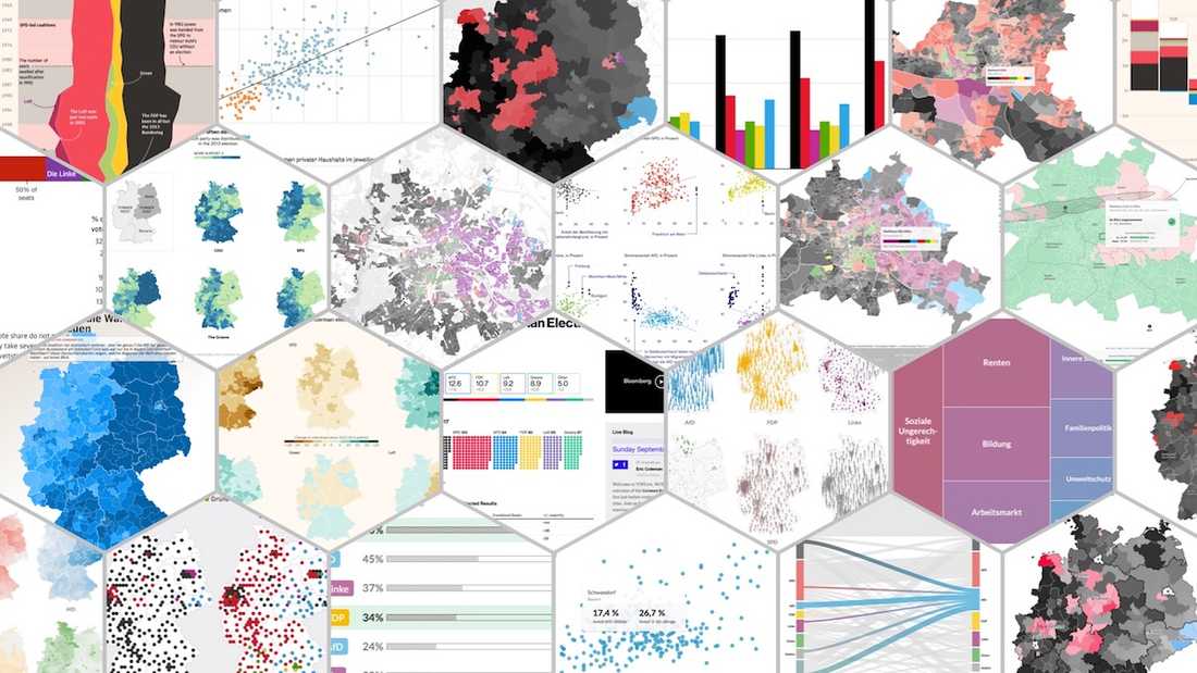
In collaboration with the interactive team of the Berliner Morgenpost we published various projects for the German federal election 2017. This post lists the projects we did among stories from other newsrooms that visualize the election results.
If you need a guide on how the german election system works, we recommend to read "German Elections – The Data Vis Explanation" by Lisa Charlotte Rost. There is also an awesome spreadsheet version. FiveThirtyEight has a very helpful piece to get you started, too.
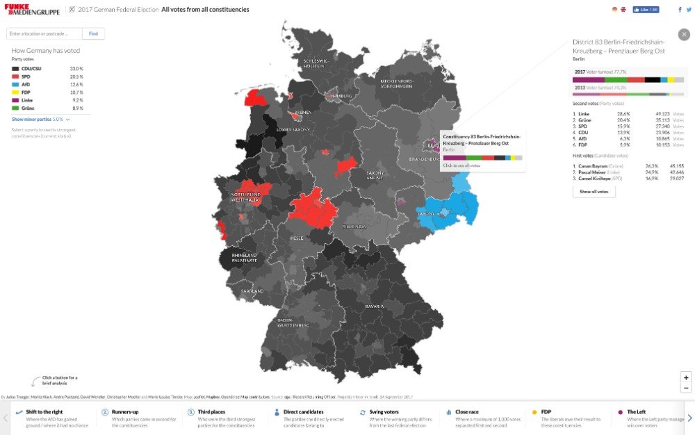
Berliner Morgenpost: Germany Election Map - Live Results
In this interactive map we visualized the results of each constituency as soon as the first results were coming in. Additionally, you can do a quick analysis to see where Germany has shifted to the right, who came in second or where the race was particularly close.
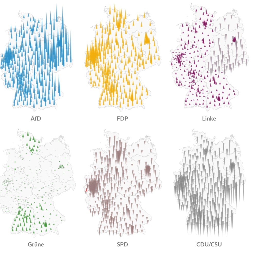
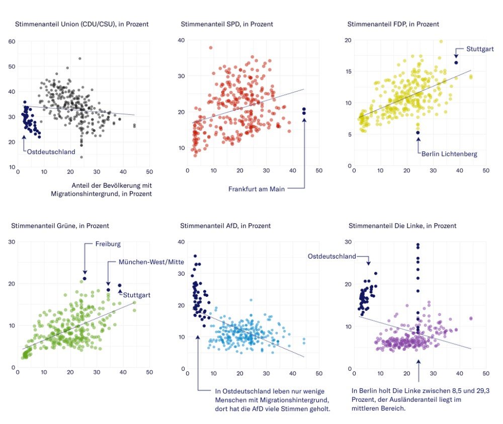
Berliner Morgenpost: Election Analysis in Charts and Maps
After counting was completed, we published this article to give a detailed analysis on the election. The applicaton shows in several static maps and charts where each competing party has their strongholds, which coalitions have the most things in common and what led to the rise of the right-wing populist party "AfD".
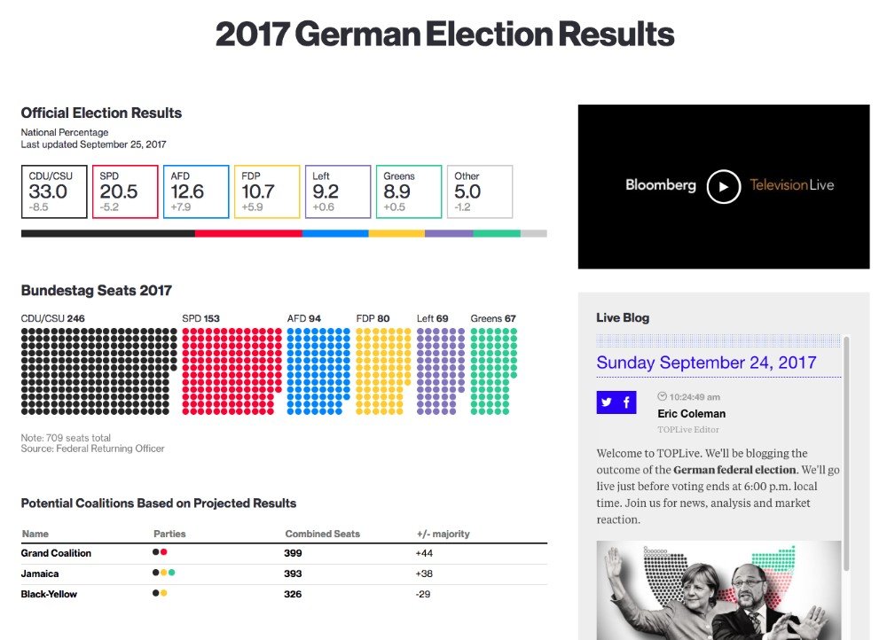
Bloomberg: 2017 German Election Results
A clean and simple overview of the election results including possible coalitions.
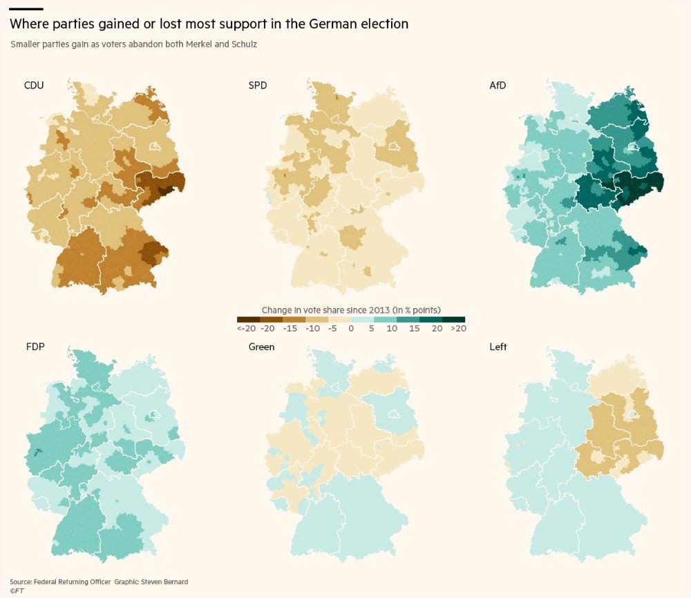
Financial Times: Germany’s Election Results in Charts and Maps
A detailed analysis of the election result including a visual history of the Bundestag, gain and losses by the parties and some scatterplots that analyse the voter demographics.
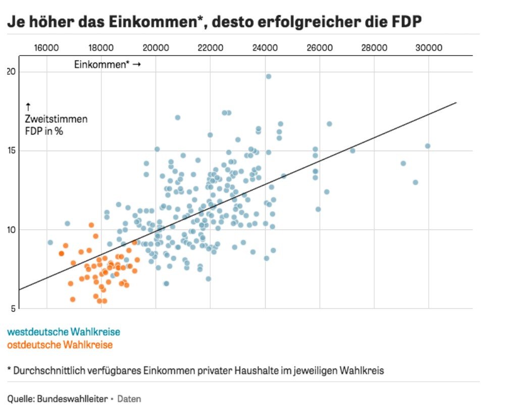
NZZ: Election Analysis
This article shows charts on how income, migration or unemployment have influenced the election result.
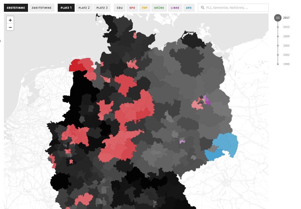
Tagesspiegel: Interactive Election Map
The interactive map shows who has won which constituency, who came in second and third and how the result compares to previous federal elections.
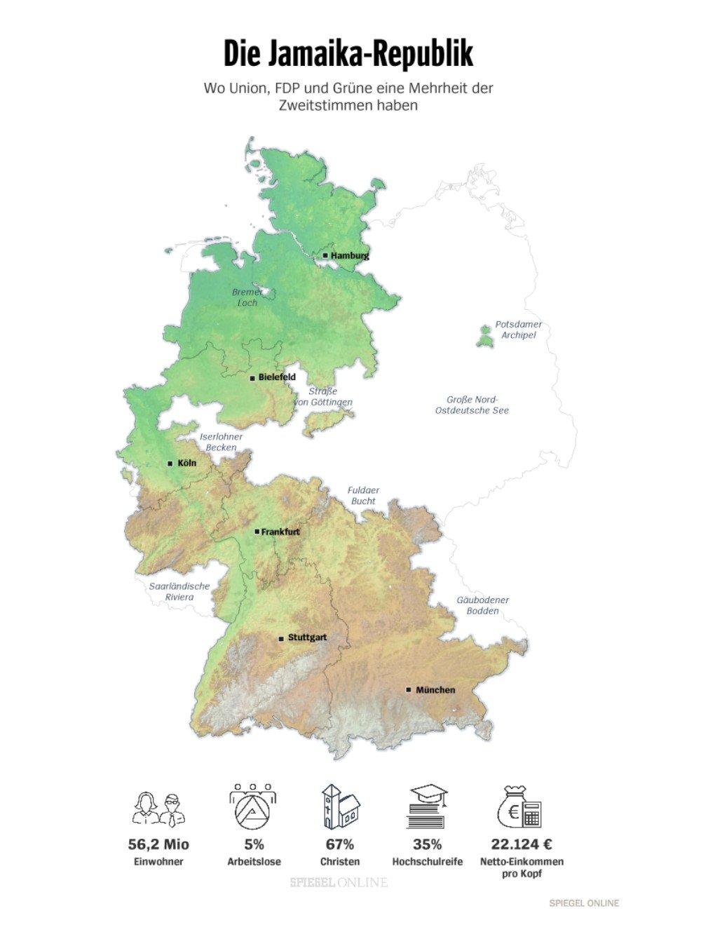
Spiegel Online: Coalition Maps
Several maps that show where the imaginable coalitions have achieved a majority in the contituencies.
Zeit Online: Election Analysis
Multiple interactive and static visualizations show different aspects of the election result.
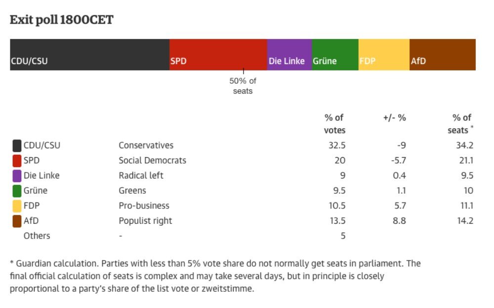
The Guardian: Exit Polls Visualization
This visualization has attracted attention in Germany because of the color used for the "AfD".
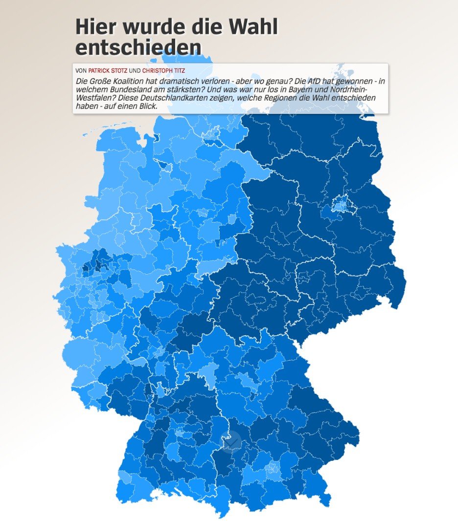
Spiegel Online: Where the election was decided
An interactive journey through the regions that had a significant impact on the election result.
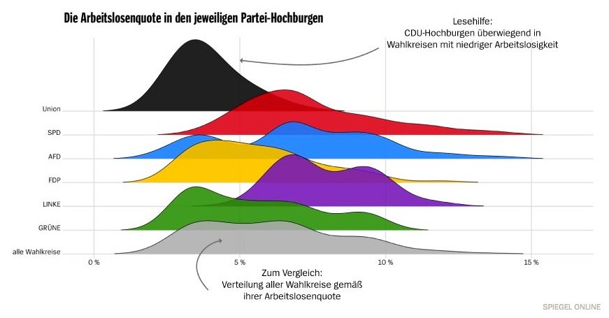
Spiegel Online: Analysis of Party Strongholds
Nice use of a joyplot visualization to show how the strongholds of the parties differ.
Local Reporting
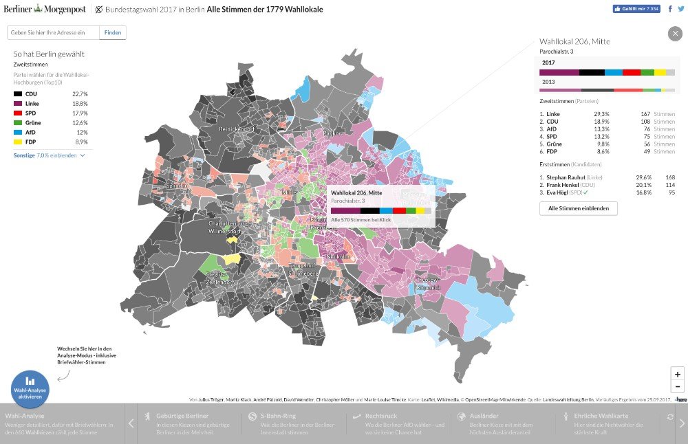
Berliner Morgenpost: How Berlin has voted
We created this interactive map based on the 2016 election map. It shows in detail how each polling station in Berlin has voted and enables the user to filter on different demographics like income, age or inside the city center.
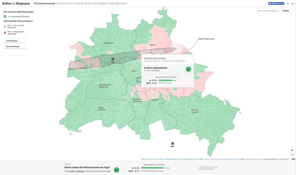
Berliner Morgenpost: Tegel Referendum Map
In addition to the election of the Bundestag, Berliners voted for a referendum to keep the Tegel Airport open once the BER Airport is finished. Our interactive map shows where Berlin has voted for and against the referendum.
The visualizations from the interactive team of the Berliner Morgenpost were also printed in the newspaper:
Auswahl unserer Grafiken zur #BTW2017 . #Berlin, Bund, BB und #Tegel heute in der @morgenpost #Infografiken #Karten #Print #Wahlanalyse pic.twitter.com/UMagmmeBFk— Christian Schlippes (@geplapper) September 26, 2017
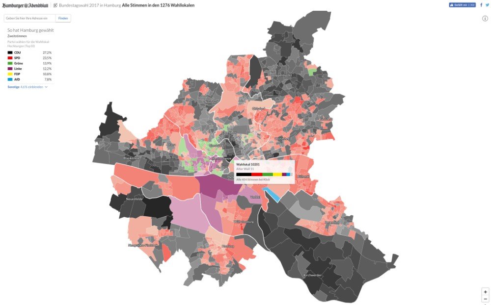
Hamburger Abendblatt: How Hamburg Has Voted
With the interactive team of the Berliner Morgenpost, we also published this interactive map that shows how Hamburg has voted. It is based on the codebase of the Berlin election map.
This visualization has been adapted for print as well:
Von Berlin nach Hamburg: Wir haben unsere Wahlkarte auch fürs @abendblatt umgesetzt. https://t.co/9vdrZWmO4k pic.twitter.com/AwWm14XbUl— Julius Tröger (@juliustroeger) September 26, 2017
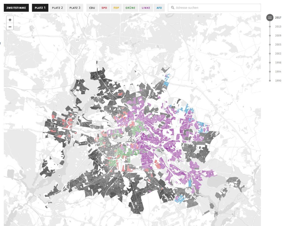
Tagesspiegel: Berlin Election Map
This interactive map shows data for every polling station in Berlin. You can also explore historical results and who came in second and third.
If you have found other interesting visualizations of the German federal election, feel free to comment or message us on twitter!
Further Reading

