Maps
Data Visualization
– March 21, 2016
How we created an interactive map with MapboxGL

Christopher Möller
@chrtze
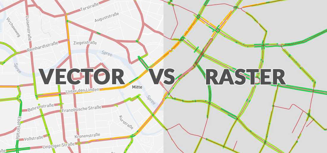
In our latest project, we have visualized the bicycle roads in Berlin. The interactive map is implemented using MapboxGL and a raster tile fallback for older browsers which do not support WebGL. This post explains the differences between the two technologies and the process of creating the visualization.
Why should I use vector tiles?
Before MapboxGL and Mapbox Studio were introduced, it was quite complicated to visualize large datasets in map applications. You first had to put all the data into TileMill, style the data with CartoCSS, generate MBTiles (which could take multiple hours sometimes) and upload it to Mapbox.
With Mapbox Studio, all these steps have become a lot of easier and faster - there is no need to learn CartoCSS anymore, for example. Because no images have to be generated anymore, it is now possible to style the whole world in realtime. Another big improvement is that the style changes you do in Mapbox Studio will be available instantly in MapboxGL. That means for example that changing a color scheme for a data visualization or fixing errors in your data takes minutes instead of hours now.
The technology of vector tiles heavily improves the look and feel of web maps, too. Big changes compared to raster tiles are: Seamless zoom, displaying and hiding features based on zoom level, fly-over animations, rotating maps or tilting maps.
How we prepared the data
In the interactive, we wanted to show how bike-friendly Berlin's streets are. For that, we are using two different datasets that we have to merge together and calculate statistics on:
- A shapefile containing the street network of Berlin
- A shapefile containing all bike paths of main roads in Berlin
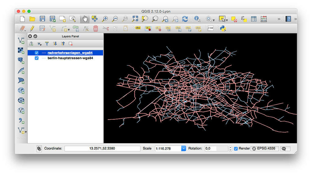
There were several problems with the datasets that we had to solve before being able to get our visualization running:
- The street dataset did have duplicate paths for some streets as they were going through different districts of the city. For being able to do the statistics correctly, we needed to merge them - even though they did not have the same ids.
- Some of the streets had to be removed as we did not want to show them in our visualization - for example highways or tunnels.
- The bike path dataset did not have attributes for identifying to which street they belong. This was something we would need to calculate the percentage of bicycle-road-coverage for each street.
So, how did we solve these problems?
To merge the streets together, we created a script (NodeJS + Turf) that will first merge all streets by their name and district. This helped us to reduce the number of duplicate streets. Still, some streets needed to be merged when they are going through different districts. We have accomplished this by buffering all streets by ten meters and looking for street-parts that have the same name and are intersecting. We ran this script multiple times, as long as nothing gets merged anymore.
In the next step, we removed highways and tunnels by simply looking at their name and removing the feature from the dataset.
The most complex part of the data processing was to associate the bike paths with their mainroad counterparts. As they did not have any common id, we first buffered them to later intersect them with the roads to find out to which they belong.
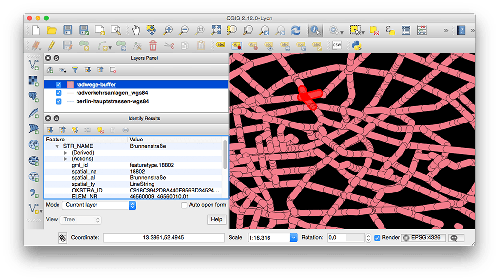
Now we wrote a script that looks for each bike path with which road it is intersecting. With all the intersections, it filters out the street that has the same name.
Now with the length of each bike path, we could add that to the street and calculate the percentage of bike-path-coverage for it. Now we were ready to create our final visualization.
Create a map with Mapbox Studio
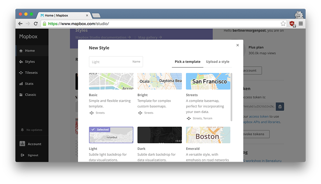
When creating a new map style, you are first asked to chose a basemap layer. This layer can be adjusted to your needs in the editor. On top of that we have added our dataset. For doing so, you can simply drag and drop shapefiles or geojson to the editor. After that you can create a new layer with the dataset as a source and add it to your map.
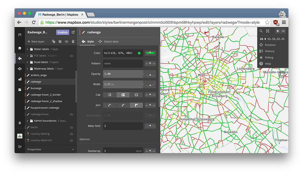
With the powerful editing functions, you can now style the data to your needs. For example, you can define the line-width of streets based on zoom level or filter datasets by their attributes for only displaying partial data. We also added some custom labels which is done by uploading a geojson with point features that have a name property containing the label text.
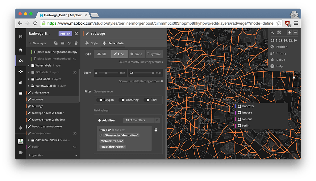
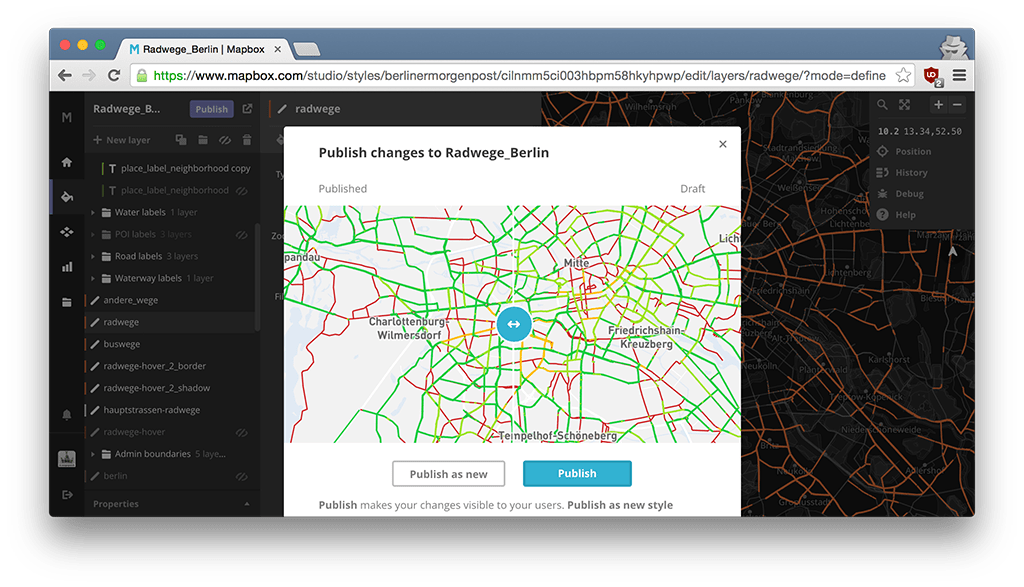
Once you are done with editing, you can publish your map and use it with MapboxGL in your frontend.
Make an interactive map with MapboxGL
To create an interactive map with the map style we just created, we installed mapbox-gl in our project and initialized our map object:
import mapboxgl from 'mapbox-gl';const map = new mapboxgl.Map({container: 'map',center: [13.3866103, 52.5170092],style: '<your map style id here>',zoom: 12,maxBounds: [[12.4393, 52.0795],[14.3262, 52.9155],],});
Now as the map is visible in the container, we only need to add interactivity such as displaying a tooltip on hover. It is somehow similar to create a tooltip with an UTFGrid. With the code example you can check which features are below the mouse while hovering the map. In the callback function we then check if there are map features hovered and display the tooltip with the properties of the closest one.
map.on('mousemove', (evt) => {//get all features close to the pointermap.featuresAt(evt.point,{radius: 15,layer: ['radwege', 'buswege', 'andere_wege'], //we chose which layers should be 'hoverable'},(err, features) => {//if features are hovered, display a tooltip with the dataif (features.length) {tooltip.update(features[0].properties);tooltip.updatePosition(evt.point);} else {//if no features were found, hide the tooltiptooltip.hide();}});});
Another huge feature of vector tiles is, that you can filter layers on the client which was not possible with raster tiles before. We used this feature to highlight a street that the user has searched for. This is how we implemented it:
/** Custom event listener, the data object contains* the center of the street as LngLat array and the* id of the street that should be highlighted*/$(document).on('search:complete', (evt, data) => {//zoom to the center of the street with animationmap.easeTo({center: data.center,zoom: 14,});//filter the street layer and only display the selected streetmap.setFilter('hauptstrassen-radwege', ['==', 'spatial_na', data.id]);// (filter other layers)});
If you want to remove a filter, you can simply show all features with this code:
map.setFilter('hauptstrassen-radwege', ['all']);
Summary
Mapbox Studio and MapboxGL are great. They have some very advanced features such as filtering datasets on the fly which make them really interesting to work with. Mapbox Studio has also simplified the process of styling maps while adding more features. If you want to start working with MapboxGL, you can check out the examples page and their api docs.
Still, MapboxGL needs WebGL which is not supported in all browsers. We had some problems on iOS Safari as well as older versions of Internet Explorer. That's why we implemented a fallback with UTFGrid and Leaflet/MapboxJS. You can read more about creating these maps here.
Thanks for reading!
Further Reading