This article introduces 5 React UI libraries. You will see how to setup and integrate them for your purposes. We will share our impressions and show an example for each library.
We found rich UX frameworks for enterprise apps and lightweight libraries for prototyping or smaller applications.
Grommet
The most advanced open source UX framework for enterprise applications. http://www.grommet.io
Grommet is a rich framework for building complex UIs, including the most common components you will need for your app. Nice to have: Grommet offers all resources in multiple graphic formats (e.g. psd, sketch…) for designers to sketch the app before developing. You can also find a well structured documentation with useful examples.
Installation:
npm install -g grommet -g gulp
Sample Component:
import React from 'react';import WorldMap from 'grommet/components/WorldMap';import '../../../node_modules/grommet/grommet.min.css';const GrometWorldMap = () => {return (<WorldMap series={[{continent: , colorIndex: , onClick: }, ...]} />);};export default GrometWorldMap;
Material UI
A Set of React Components that Implement Google's Material Design. http://www.material-ui.com
Material UI is a collection of beautiful material design react components. You will find all necessary modules to be exemplary and well documented. As we tested so far, everything works reliably both on mobile and on desktop. Differing from the previous UI framework, Material UI components are rendering with a default material ui style theme. Overrides are possible in two ways, using inline styles or configuring the MUI theme.
Installation:
npm install material-ui
Sample Component:
import React from 'react';import AutoComplete from 'material-ui/AutoComplete';const libs = ['Material UI', 'Elemental UI', 'Grommet', 'Mui', 'Rebass'];const MaterialEx = () => {return (<div><AutoCompletefloatingLabelText=\"Type something ...\"filter={AutoComplete.fuzzyFilter}dataSource={libs}maxSearchResults={3}menuStyle={{ background: '#fff' }}/></div>);};export default MaterialEx;

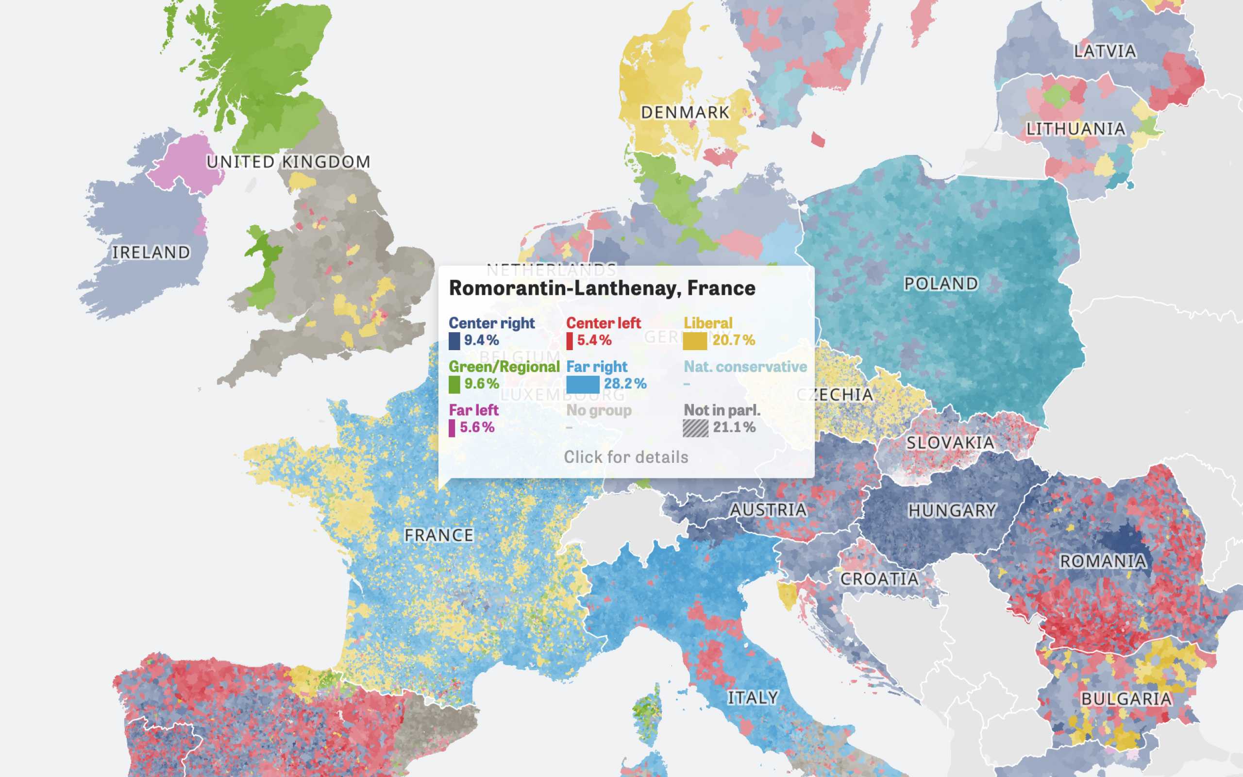
Colors Of Europe
Interactive Data Visualization (Zeit Online)
Are you interested in a collaboration?
We are specialized in creating custom data visualizations and web-based tools.
Elemental UI
A UI Toolkit for React.js Websites and Apps. http://elemental-ui.com
Unlike the previous examples, elemental is a lightweight library. It offers a grid, css styles and components like buttons, forms or modals. All components are well documented. A downside is that the setup steps aren't included in the documentation, so the installation took a little longer than expected.
Installation:
npm install elemental -S less-loader -S less -S react-addons-css-transition-group -S
If you´re using webpack, add the following snippet to your loaders
{test: /\\.less$/,loader: \"style!css!less\"}
Import the main less file to your component as you see below
Sample Component:
import React from 'react';import { Spinner, Pagination } from 'elemental';// you need to include the less files and adjust your webpack config in order to load less filesimport '../../../node_modules/elemental/less/elemental.less';const ElementalUI = () => {return (<div><PaginationcurrentPage={1}onPageSelect={null}pageSize={25}plural={'Sites'}singular={'Site'}total={150}limit={6}/></div>);};export default ElementalUI;
Rebass
57 Configurable React Stateless Functional UI Components. http://jxnblk.com/rebass/
Rebass offers 57 nice components. You can use these components without importing any CSS dependencies or adjusting your webpack loaders. This makes it really comfortable to use compared to the other libraries. The components are stateless functional react components which are customizable with inline styles or through react context.
Installation:
npm install rebass
Sample Component:
import React from 'react';import { SequenceMap, Switch } from 'rebass/styled-components';const RebassEx = () => {return (<div><SequenceMapactive={1}steps={[{'children: 'Step 1'}, {'children: 'Step 2'}, {'children: 'Step 3'}]}/><Switch checked /><label>on | off</label></div>);};export default RebassEx;
MUI
MUI is a lightweight CSS framework that follows Google's Material Design guidelines. https://www.muicss.com
MUI was already a topic in another blogpost by webkid. Not only does it offer react components which follow Google’s Material Design, you can also find angular, webcomponents, iOS, Android or email templates. MUI also provides a corresponding sketch file for the designing process.
Installation:
npm install muicss
Sample Component:
import React from 'react';// you need to include the css files and adjust your webpack config in order to load css filesimport '../../../node_modules/muicss/lib/css/mui.min.css';import { Tabs, Tab, Button, Container } from 'muicss/react';const MuiEx = () => {return (<div><Tabs justified><Tab value=\"pane-1\" label=\"Tab 1\" /><Tab value=\"pane-2\" label=\"Tab 2\" /></Tabs><Container fluid><Button color=\"accent\" variant=\"raised\">Click me</Button></Container></div>);};export default MuiEx;
If you´re interested in more React UI stuff, then checkout the official react wiki or the awesome react list.
Further Reading
