At the moment we are working on datablocks - a flow based editor for processing, analyzing and visualizing data. When we started with datablocks we wanted to create a unique look so we didn't use a big UI library. We decided to use Rebass but unfortunately it's no longer maintained and we also recognized that we need more features like modals, confirm dialogs, a notification system and so on. We have developed a few of these features ourselves but it feels like we spend too much time on UI related tasks and therefore have less time for the actual things we want to work on. I have done a little research and want to share my findings here with you.
Active Projects Sorted by Stars
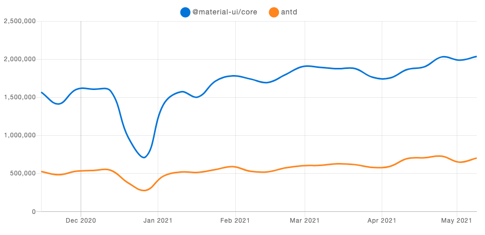
All projects in the following list are maintained (as of 20 March 2021) and make a good impression at first sight. It's a mix of simple libraries and more complex design system framworks. I wasn't sure how to sort the projects in a meaningful way so I decided to sort by stars on Github. It shouldn't be the most important factor in choosing a library but it helps to get a first impression. In the following list Ant Design is the project with the most stars (71k+) on Github. Material-UI has only a few stars (68k+) less but has had way more downloads in the past 6 months according to npm trends:
It's not easy to give a good impression with a simple screenshot of the docs so I decided to add one of the buttons for every project.
Ant Design
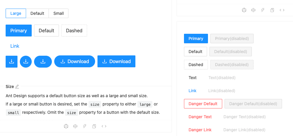
Ant Design is a ui library and a design language. It includes a lot of components, typography guidelines and its own icon set. Ant Design comes with simple components such as
Button and Dropdown but also includes complex ones like DatePicker and FileUpload.Material-UI
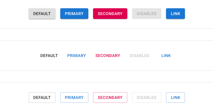
Material-UI also brings a lot of components. Besides that they have some interesting upcoming features in their lab like a
DataGrid or an Autocomplete component. Although it is called "Material-UI" it is possible to create your own themes and use the framework only as a design system.React Bootstrap

As the name implies this is the very famous Bootstrap framework built with React. There is also another one called reactstrap (10k stars) that looks very similar in what it does.
chakra
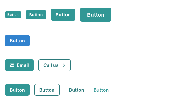
Chakra is based on emotion and written in Typescript. It supports multiple color modes (like light and dark mode) and includes a lot of components, layout helpers and also hooks for handling copying content to the clipboard for example.
Fluent UI
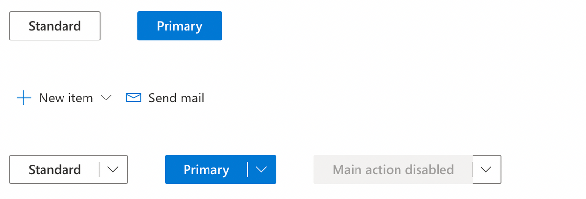
Fluent UI comes from Microsoft and is not only available as a React package but also as Web Components and native libraries for iOS, macOS, Android and Windows (of course). It has components for building forms and lists but also offers very specific ones like a
PeoplePicker for example.Evergreen
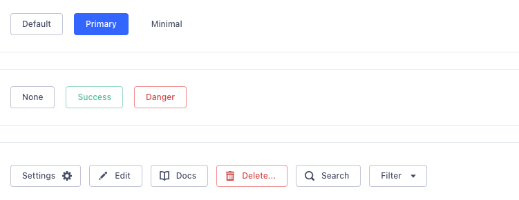
Evergreen has a light and modern appearance. It offers 33 components from
AutoComplete to Table. I think some grouping of the components would make the docs clearer. I really like that they offer a figma library and they are working on patterns for handling "Error Messages" and "Table Layouts".Grommet
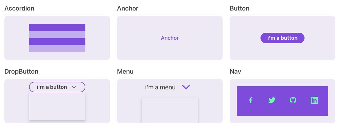
Grommet looks nice and bold. It has a focus on accessibility and comes with keyboard navigation and screen reader tags. Besides layouting helpers and UI components it includes visualizations and utils for creating infinite scrolls or handling keyboard events.
Base Web

This project can be used as a foundation for your components. It has simple primitives like a
Layer and advanced components like a FileUploader. The base styles are very simple but they can be customized by using the Overrides API or theming.React Suite
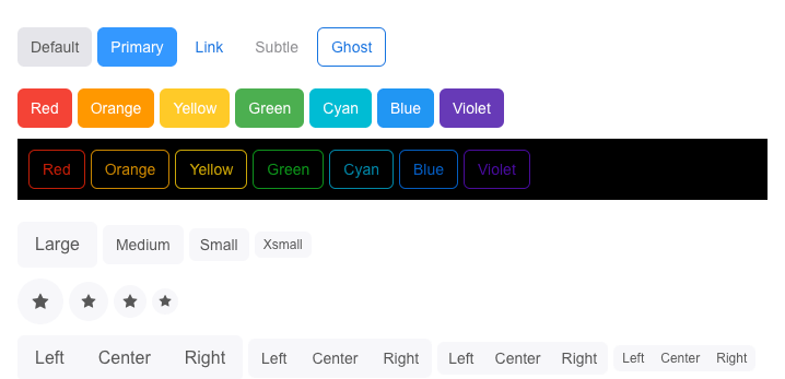
This project can really call itself a suite. It comes with 54 component. From simple ones such as
Popover and Dropdown to more advanced ones such as a DatePicker or a Table. It also includes icons and extensions for creating charts (@rsuite/charts) or validating forms (@rsuite/schema-form).Reach UI

Reach UI offers every component as its own npm module. It's considered as a foundation for a design system rather than a styled UI library. It has 15 components like a
Slider and an AlertDialog and some helpers for generating ids or measuring components.Theme UI

Theme UI helps you to build "themeable React apps based on constraint-based design principles". It comes with components like
Button and form inputs and really helps you to implement responsive styles easily through an advanced theming concept.Geist

Geist is inspired by Vercel's design. It looks really clean and brings a lot of components. The documentation is really well structured and you can configure the theme and the entire documentation will adapt the changes. Besides components it has hooks such as
use-body-scroll and use-click-away.Mantine

Recently I stumbled across Mantine and really liked the website and default styles for the components. Everything looks clean and modern and besides 40+ components it also comes with a lot of helpful hooks such as
use-clipboard and use-click-outside. Another great thing about Mantine is that it has dark theme built-in "natively without any additional steps".Special Interest
Arwes

Arwes looks really cool. It's a sci-Fi UI library that even offers beep sounds for your interactions (I think it's the only one in this list that comes with sounds). It has really fancy animated effects for the components and a super unique spaceship look.
React95

If you want to style your website with a Windows 95 look and feel, this library is exactly what you need. The authors put a lot of attention to detail and all the components look very windows-ish.
Update
We received some interesting library tips from people on twitter and via mail. We will list them here:
The Right Choice
These are just some libraries that I found on GitHub during my research but I am sure there are a lot more very good ones that are less popular. I am still not sure what's the best choice for our project but I tend to use Mantine. It's not too overwhelming but has all features we need like a notification system and good SSR support for example.
If you have any feedback or questions you can write me a mail moritz{at}webkid.io or contact me on twitter @moklick.
Further Reading
