Data Visualization
Open Source
– November 23, 2015
Some simple tricks for creating responsive charts with D3

Christopher Möller
@chrtze
In this post I have collected some techniques that I used recently when creating D3 Charts. With focus on small screens, these examples might help you to improve the readability and usability of your charts.
- Create test data
- Setup a basic chart
- Render the chart on resize
- Use aspect ratio instead of fixed height
- Inset y-axis labels on small viewports
- Prevent overlapping of x-axis labels
- Add a simple swipe gesture
- Create generic annotations
- Conclusion
Create test data
We will need some test data that we want to show in our visualization. Therefore, I created a simple node.js script that creates a
data.csv file which contains a date and a value column.var fs = require('fs');var startDate = new Date('2014-1-1');var endDate = new Date('2015-1-1');var csv = 'date,value\n';for (var i = startDate;i < endDate;startDate.setDate(startDate.getDate() + 10)) {csv += '' + startDate.toString() + ',' + Math.random() + '\n';}fs.writeFileSync('data.csv', csv);
create-data.js
You can run the script with this command:
$ node create-data.js
After that, you will see that the file
data.csv has been created. It look somewhat similar to this:date,valueWed Jan 01 2014 00:00:00 GMT+0100 (CET),0.505003142170608Sat Jan 11 2014 00:00:00 GMT+0100 (CET),0.5459181617479771Tue Jan 21 2014 00:00:00 GMT+0100 (CET),0.14592946274206042Fri Jan 31 2014 00:00:00 GMT+0100 (CET),0.7082753519061953...
data.csv
Setup a basic chart
To get started with the example, create a new directory and add three files:
index.html, style.css and chart.js.<!DOCTYPE html><html lang="en"><head><meta charset="UTF-8" /><meta name="viewport" content="width=device-width" /><title>D3 Line Chart</title><link rel="stylesheet" href="style.css" /><script src="//d3js.org/d3.v3.min.js" charset="utf-8"></script></head><body><div id="chart"></div><script src="chart.js"></script></body></html>
index.html
var Chart = (function (window, d3) {var svg,data,x,y,xAxis,yAxis,dim,chartWrapper,line,path,margin = {},width,height;d3.csv('data.csv', init); //load data, then initialize chart//called once the data is loadedfunction init(csv) {data = csv;//initialize scalesxExtent = d3.extent(data, function (d, i) {return new Date(d.date);});yExtent = d3.extent(data, function (d, i) {return d.value;});x = d3.time.scale().domain(xExtent);y = d3.scale.linear().domain(yExtent);//initialize axisxAxis = d3.svg.axis().orient('bottom');yAxis = d3.svg.axis().orient('left');//the path generator for the line chartline = d3.svg.line().x(function (d) {return x(new Date(d.date));}).y(function (d) {return y(d.value);});//initialize svgsvg = d3.select('#chart').append('svg');chartWrapper = svg.append('g');path = chartWrapper.append('path').datum(data).classed('line', true);chartWrapper.append('g').classed('x axis', true);chartWrapper.append('g').classed('y axis', true);//render the chartrender();}function render() {//get dimensions based on window sizeupdateDimensions(window.innerWidth);//update x and y scales to new dimensionsx.range([0, width]);y.range([height, 0]);//update svg elements to new dimensionssvg.attr('width', width + margin.right + margin.left).attr('height', height + margin.top + margin.bottom);chartWrapper.attr('transform','translate(' + margin.left + ',' + margin.top + ')');//update the axis and linexAxis.scale(x);yAxis.scale(y);svg.select('.x.axis').attr('transform', 'translate(0,' + height + ')').call(xAxis);svg.select('.y.axis').call(yAxis);path.attr('d', line);}function updateDimensions(winWidth) {margin.top = 20;margin.right = 50;margin.left = 50;margin.bottom = 50;width = winWidth - margin.left - margin.right;height = 500 - margin.top - margin.bottom;}return {render: render,};})(window, d3);
chart.js
The script you see above is doing three things: It first loads the data from the csv file. Based on the data, it then initializes all variables which are used to display the chart. This includes creating the SVG that is needed for the chart and adding it to the DOM. All that stuff is done in the
init function. After that, the chart is rendered based on the current viewport dimensions. The main thing to notice here is that the init function should only be called once, as it prepares everything for rendering, whereas render can be called many times and will render the chart according to viewport size and other parameters.In
style.css I added some CSS to make the chart look a bit better. This is just some basic styling taken from Mike Bostock's Line Chart example.body {font: 12px sans-serif;margin: 0;}.axis path,.axis line {fill: none;stroke: #000;shape-rendering: crispEdges;}.x.axis path {display: none;}.line {fill: none;stroke: steelblue;stroke-width: 1.5px;}
style.css
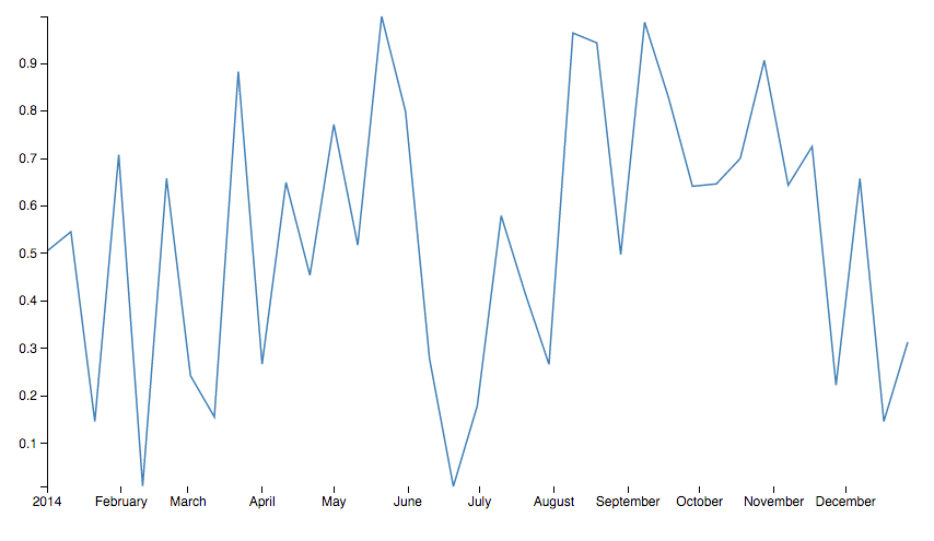
All this code together produces a line chart:

Now we can add some more functionality that will improve the chart step by step.

Colors Of Europe
Interactive Data Visualization (Zeit Online)
Are you interested in a collaboration?
We are specialized in creating custom data visualizations and web-based tools.
Render the chart on resize
In order to make the chart fit the screen once you resize the browser window I usually listen to the resize event and re-render the chart once the event is fired. In code that would look like this:
window.addEventListener('resize', Chart.render);
Use aspect ratio instead of fixed height
I have seen many interactives, where the charts are given a fixed height. As you can see above, this makes it hard to read the chart on smaller screens because the width of the chart gets smaller than its height at some point. To get around this, I added a fixed aspect ratio which is used to calculate the height of the interactive. This makes the chart behave similar to an image or video element which always keeps its aspect ratio when resized to smaller viewports. In the setup that we use for creating the chart, we have to change one line in the
updateDimensions function:height = 0.7 * width; //aspect ratio is 0.7
function updateDimensions(winWidth)
If you resize the chart now, you can see that it resizes similar to an image.
Inset y-axis labels on small viewports
As you can see above, the y-axis labels are taking a lot of space on smaller screens. To give the actual chart as much space as possible, one possible solution could be to inset the labels and remove left and right margins when the screen gets smaller than a specific breakpoint. Therefore, you have to make some small adjustments to the
updateDimensions and render function.First, you should define a breakpoint which is used to check if we are on small screens or not. Of course, you could add multiple breakpoints if you want to render multiple different views of the chart.
var breakPoint = 768;
Then, in the
updateDimensions function we check, if the screen is smaller than the breakpoint and remove the horizontal margins if necessary:margin.right = winWidth < breakPoint ? 0 : 50;margin.left = winWidth < breakPoint ? 0 : 50;
function updateDimensions(winWidth)
After that, we need to configure the chart to inset the labels on small screens. This can be done directly in the
render function by setting the orientation of the axis using D3:yAxis.scale(y).orient(window.innerWidth < breakPoint ? 'right' : 'left');
function render()
You can see that the labels of the Y-Axis jump inside the chart, once we resize to the defined breakpoint.
Prevent overlapping of x-axis labels
Another common problem with responsive charts and D3 is that once the screen gets smaller, the labels of the x-axis could overlap. To accomplish that, we could check for the window size again and reduce the number of ticks on the X-Axis if the screen size is small. Sticking to the example, this is how you just show a label for every second month:
if (window.innerWidth < breakPoint) {xAxis.ticks(d3.time.month, 2);} else {xAxis.ticks(d3.time.month, 1);}
function render()
In the result, you can see that labels are not overlapping anymore.
Before

After

Add a simple swipe gesture
One thing that I often miss in interactive charts is the ability to swipe over the chart to see values or tooltips. In most cases, you have to tap exactly at the point that you want to see. In the next steps, I will explain how you can support a swipe gesture in interactive charts with few lines of code.
At first, we create a fake tooltip in our init function:
locator = chartWrapper.append('circle').style('display', 'none').attr('r', 10).attr('fill', '#f00');
Now, we need to listen to the
mousemove event on the chart-wrapper to calculate the position of the locator.chartWrapper.on('touchmove', onTouchMove);
In the
onTouchMove function, we will get the touch position of the user. With the help of a linear scale, we map the x-coordinate to the index of the data array. With that index, we can get the data at the point that the user is currently focusing. That data is than used to position the locator:var touchScale = d3.scale.linear().domain([0, width]).range([0, data.length - 1]).clamp(true);function onTouchMove() {var xPos = d3.touches(this)[0][0];var d = data[~~touchScale(xPos)];locator.attr({cx: x(new Date(d.date)),cy: y(d.value),}).style('display', 'block');}
If we now swipe over the chart on touch devices, the locator or tooltip moves with the touch of the user.
Create generic annotations
For responsive charts, it can sometimes be a bit tricky to create annotations or labels that are keeping their position on all viewports. For achieving this, I am using the following technique. First I am creating a configuration object that stores the text and position of the labels I want to render into the chart:
var labels = [{x: new Date('03-15-2014'),y: 0.17,text: 'Test Label 1',orient: 'right',},{x: new Date('10-25-2014'),y: 0.24,text: 'Test Label 2',orient: 'right',},];
Then, based on this configuration I render the labels using D3. Note that I am using the same scales that are used in for the whole chart. This gives you some freedom to adjust the position of the labels by adjusting the values in their config object. Another thing I am doing here is to set the orientation of the labels. This is done by simply setting the
text-anchor property on the text nodes.function renderLabels() {chartWrapper.selectAll('text.label').data(labels).enter().append('text').attr('x', function (d) {return x(d.x);}).attr('y', function (d) {return y(d.y);}).style('text-anchor', function (d) {return d.orient == 'right' ? 'start' : 'end';}).text(function (d) {return d.text;});}
If you call
renderLabels inside of the render function, you will notice that everytime the browser window is resized, new labels will be appended to the SVG. To prevent this, I check if labels are already existing. If the labels already exist, we just update their position respective to the scales. Now the renderLabels function looks like this:function renderLabels() {var _labels = chartWrapper.selectAll('text.label');if (_labels[0].length > 0) {//labels already exist_labels.attr('x', function (d) {return x(d.x);}).attr('y', function (d) {return y(d.y);});} else {//append labels if function is called for the first time_labels.data(labels).enter().append('text').classed('label', true).attr('x', function (d) {return x(d.x);}).attr('y', function (d) {return y(d.y);}).style('text-anchor', function (d) {return d.orient == 'right' ? 'start' : 'end';}).text(function (d) {return d.text;});}}
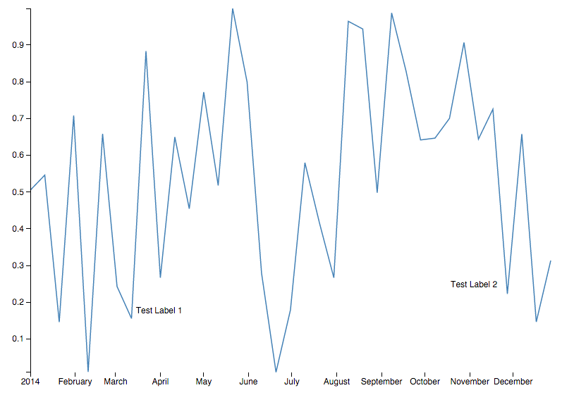
If you look at the chart now, you can see that you have basic annotations that scale with the chart.

Conclusion
I have created a public Gist containing the source code of the example. You can see a live demo as well. Most of the stuff I have mentioned in the article is also used in this production example that I have developed for Berliner Morgenpost recently.
The techniques I have mentioned here are just very basic examples. As with other examples, it always depend on what you want to visualize and what your dataset looks like. Anyway, you may find it useful to have a look at working examples and may reuse bits of code in your own charts. If you have any suggestions or found a mistake in my code, you can contact me via Twitter. Thanks for reading!
Further Reading